
Charts on Every Activity
by The Next Race
A finished run used to give you a summary and a map. The numbers were there, but not the shape of the effort: when the heart rate crept up, where the hills were, whether your cadence held when you got tired.
Starting today, every activity in TNR Go has a Charts tab.
One Tab for the Whole Run
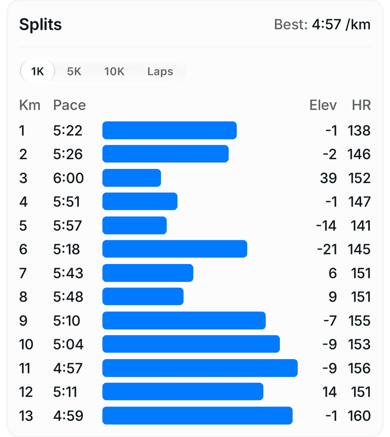
Open an activity and you'll find three tabs: Details, Charts and Comments. Charts opens with your splits and time in zones, then gives every metric your watch recorded its own card: pace, elevation, heart rate, cadence, power and stride length.
Each card shows the max and average next to its title, a dashed line for the average and a faint line at every kilometre. The time axis is in minutes, and most charts start their vertical axis at zero, so a steady run looks steady instead of every small wobble looking dramatic.
Pace and Heart Rate in Your Zones
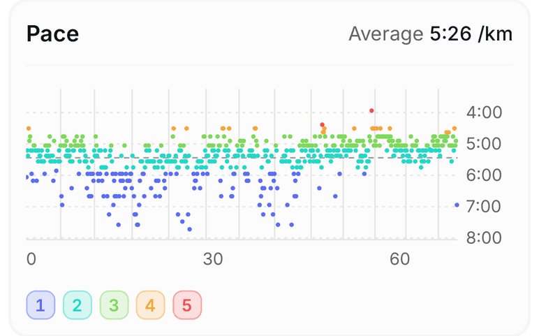
Pace is coloured by your own pace zones, worked out from your threshold pace. You can see at a glance which parts of the run were easy, which were tempo and which went over threshold. Heart rate is coloured the same way once your heart-rate zones are set.
Elevation
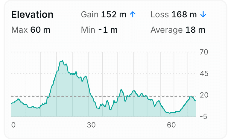
Gain, loss, max, min and average at the top, the profile underneath. The axis starts at the lowest point of the run, so a run along the coast and a run in the mountains both use the full height of the card.
Heart Rate vs Your Normal
This is the one we're most excited about. TNR looks at your last 30 runs from the past four months and works out what your heart rate usually is at each pace. Today's heart rate is drawn on top of that band.
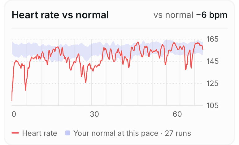
The number in the corner is the difference. Six beats below your normal at the same pace means you were fresh, it was cool, or your fitness is moving. Six above can mean heat, a bad night's sleep or a cold on the way. A watch shows you one run. TNR knows your history, so it can tell you what this run means.
Heartbeats per Kilometre
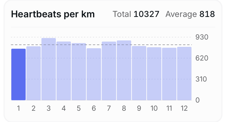
How many times your heart beat to cover each kilometre. It's a simple measure of what each kilometre cost you: a fast kilometre at a low heart rate is cheap, and a slow one with your heart racing is expensive. The cheapest kilometre is highlighted, and the total and average sit in the corner.
Cadence, Power and Stride Length
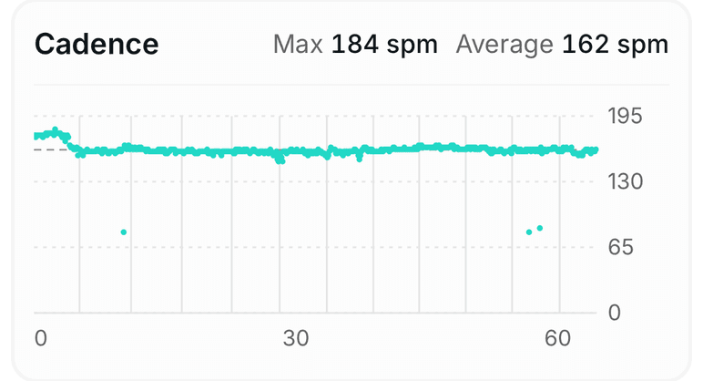
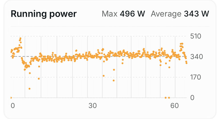
Cadence is now in steps per minute everywhere in TNR Go. Some watches and Strava count one leg, which made a normal 170 spm show up as 85. Running power comes straight from your watch or pod. Stride length uses the watch's own measurement when it records one, and is worked out from speed and cadence when it doesn't.
Running Dynamics
If your watch measures running form, TNR now charts it: ground contact time, vertical oscillation and vertical ratio. Most recent Garmin Forerunner and fenix watches record them, and so do recent Apple Watch models.
These come from the watch's own files, so they need a direct connection:
- Garmin: connect Garmin in TNR. Each run's file is decoded the first time you open it.
- Apple Watch: connect Apple Health in TNR Go. Workouts you've already imported are re-read once when you open them.
- Polar and Wahoo: connect them directly and their files are read the same way.
Strava doesn't pass running dynamics on through its API, so a run that only reaches TNR through Strava won't have these cards.
Swims, Length by Length
Pool swims from an Apple Watch or a Garmin now keep every length: when it started, how long it took and how many strokes it took. The Charts tab turns that into stroke rate per length, SWOLF (time plus strokes, lower is better) and strokes per length, with your rests showing as gaps.
Getting It
The Charts tab is in TNR Go now. The update arrives on its own the next time you restart the app. If you don't have TNR Go yet, read about it here or get started.
We'd love your feedback. Which chart do you check first, and what's missing? Tell us in the app under Settings → Feedback.